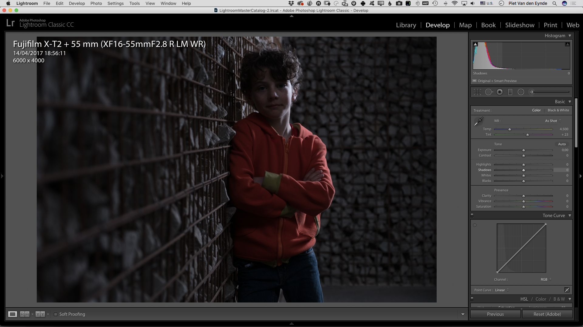
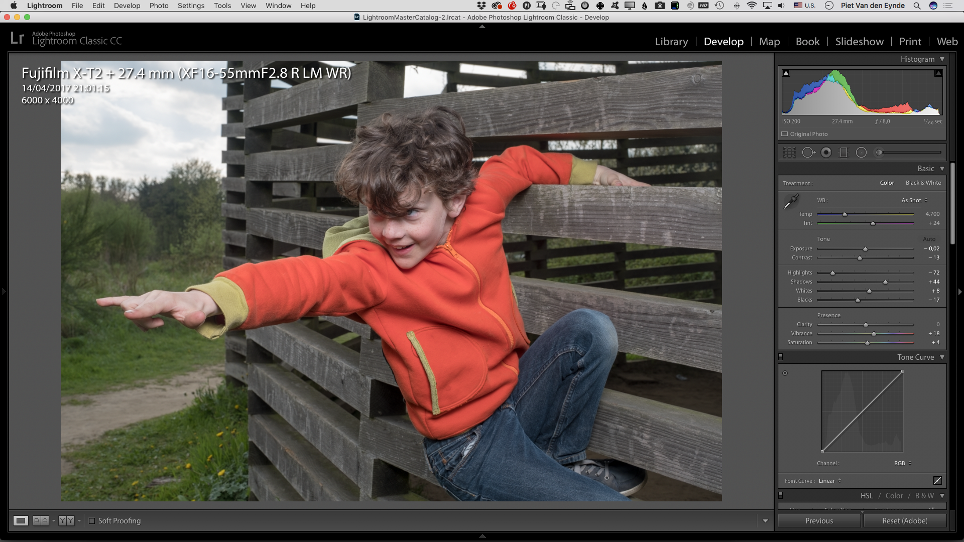
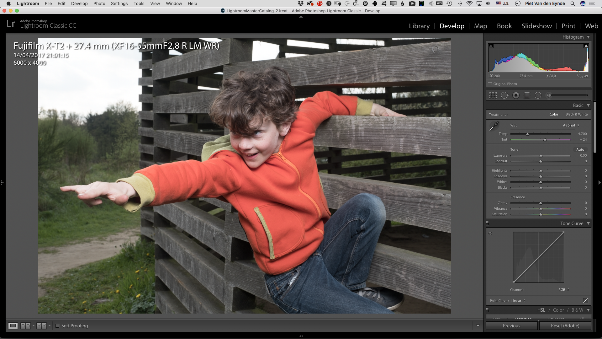
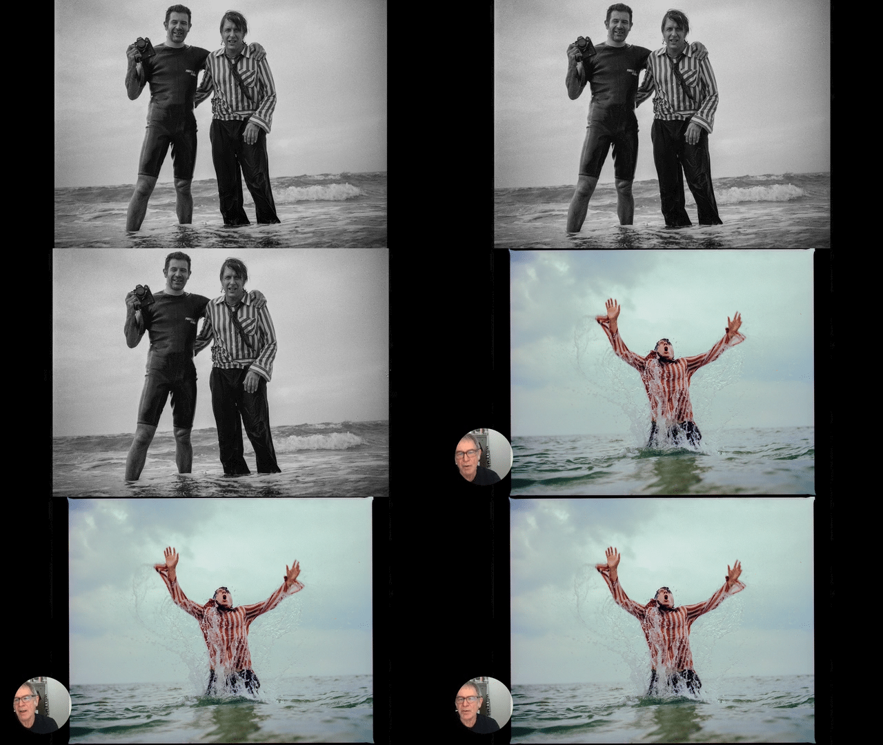
Does this sound familiar? Once you've applied a setting to Lightroom’s Brush, Radial filter, or Graduated filter, those settings seem to haunt you just about everywhere and all the time? In this short video tip, I explain how you can get rid of that behaviour, apply your own default settings and how you can also change them again if necessary.
Lightroom
3 ways to get dramatic dark skies in your Lightroom Black & White conversions
I just love Black & White conversions with dark, almost pitch-black skies. In this video, I’ll show you three ways you can achieve this effect in Lightroom, without needing a single local adjustment. Have a look!
Face Light in Lightroom
One of my favorite features in Luminar is the Face Light tool, with which you can automatically brighten faces in a photo. In the video below I try to put together something similar in Lightroom Classic, without the Artificial Intelligence part, though!
If you prefer Luminar after all, don’t forget that you can score a 10€/USD discount by using this affiliate link and entering coupon code MORETHANWORDS upon checkout.
Varanasi Before and After
Is it the memories of the narrow alleyways, the photogenic people, the company of like-minded photographers or simply that fantastic hole-in-the-wall place with the heavenly chocolate coconut banana dosas? I don't know, but editing this picture sure made me want to go back to Varanasi for a new edition of the Varanasi Location Portraiture and Lighting Masterclass. The last one Matt Brandon and I did, dates back to 2017 and that's a long time to be without those delicious pancakes!
But first things first: I actually only wanted to do a before-and-after type of blog post on editing an image in Lightroom. While scrolling through my Library, I stumbled across this image that I made in 2016 with my Fujifilm X-T1. I still remember Matt and me seeing this photogenic sadhu and escorting him away from the busy main street into a calmer alleyway to have our participants photograph him using off-camera flash. While Matt was setting up the shot, I made this photo almost by accident. It was more meant as a behind-the-scenes type of shot, but as I liked the three characters (did you actually already notice the kid in the lower left part?) in the picture, I decided I would try to resuscitate it in Lightroom.
Step 1: Adjusting Exposure and Shadows
Time after time, I'm amazed at what you can do with the handful of sliders in Lightroom's Standard Panel in the Develop Module. I increased the Exposure and maxed out the Shadows slider all the way to +100. This made me see a new problem: Matt's also in the picture. That's what those ultrawide angle zooms will do for you!
Step 2: Cropping and Straightening the Image
I don't know if I should see a therapist, but I have a thing with straight lines. In an image, I want my verticals and horizontals either completely wonky or dead straight. Not something in the middle as in this shot. So I opened up the Transform Panel and activated the Guided Upright tool (1). I drew a line parallel over a wall in the left of the image (2) that I wished were vertical and did the same with a wall on the right (3). Doing so, I told Lightroom it had to straighten those lines and make them parallel. Sometimes, this correction will cause the image to become too compressed or too elongated, but the Aspect Ratio (4) slider can easily fix that for you.
I subsequently activated the Crop tool (R) (5) and made a square crop. This also almost solved the problem of Matt being in the picture. All that was left was a part of his camera, which I took out in one fell swoop of the Healing Brush. In retrospect, I actually shouldn't have done that at this stage, as my subsequent vignetting took care of the problem automatically.
Step 3: Adding a Graduated Filter
Because I still did not like the light-dark balance between the left and the right part of the image, I added a Graduated Filter to brighten the darkest part of the alleyway a bit more. By choosing a relatively soft transition zone (1), this adjustment blends in unnoticed.
Step 4: Color Grading via the new Creative Profiles
The previous steps were mainly meant to improve the image's exposure and balance, but they weren't necessarily creative, rather corrective. In this step I decided on my Colour Grading: choosing the subjective 'Look and Feel' for the image. I used to use Lightroom presets for that, but ever since they've been introduced in Lightroom Classic CC 7.3, I now prefer to use the Creative Profiles. Not in the least because of their handy Amount slider that lets you adjust their effect all the way between 0 and 200 percent! In this case, I chose the Dark Color Pop profile from my brand new Piet's Creative Profiles Starter Pack (available here for only $14.95) and I diminished its strength to 70 percent.
Step 5: Brightening (Dodging) the face of the man in the background
I sometimes jump around a bit while I'm editing my images. One of the things the profile caused was for the face of the man in the background to turn too dark. So I drew a Radial Filter over his face (1) and brought up the Shadows slider to +100 (2). That didn't do much, though. In those cases where the targeted Shadows or Highlights sliders don't seem to do anything, it's time to move to the broader range of the Exposure slider. However, its sledgehammer approach also caused the surrounding wall to brighten, creating a telltale halo around the man's head. So I turned to one of my favourite new tools in Lightroom Classic CC: the Range Mask. By activating the Luminosity Range Mask (3), I could direct the Exposure slider's effect to specific brightness zones within the overall limits of the Radial Filter's perimeter (in this case the levels between 0 and 26). This way, I could use a fairly blunt tool (the Radial Filter) and still create an utterly precise mask without having to paint it manually with the Adjustment Brush. Further in this Before & After, you'll see another example of the power of this tool, when I use it to simply change the towel's colour!
Step 6: Darkening the Foreground with a Graduated Filter
As I thought the lower right corner was still too bright, I added an extra Graduated Filter to darken it, thereby focusing even more on the subjects.
Step 7: Changing the Towel's Color
Ok. This step is the most spectacular one in this entire Before & After, I think! The towel that our sadhu used to protect his spotless white attire from the dirt of the Varanasi streets, is quite the attention-grabber. That's not only because of its size, but mainly because of its color. Baby-blue might look good on newborns, but it definitely is out of place in the otherwise warm color palette of this image. My first idea was to Photoshop the towel out but it's quite a lot of work to do in a believable way and... this is supposed to be a Lightroom tutorial! So I tried the following: I used the Adjustment Brush to paint a fairly rough mask over the towel. I increased the Temp slider (1) to make it warmer and subsequently lowered the Saturation slider (2) to reduce the saturation of the existing colour. Then I went on to choose a new color in the Color rectangle (3) that better integrated with the surroundings. In order to make the mask coincide completely with the actual towel, I activated the Color Range Mask tool (4) and used its Color Picker (5) to drag and select the blue hues in the towel. This told Lightroom to only adjust those blue pixels within the original, slightly broader and rougher Adjustment Brush mask. You can see the result in the next picture: I changed the towel's colour from blue to beige without resorting to Photoshop!
Step 8: Adjusting the Color of the Sadhu's Clothes
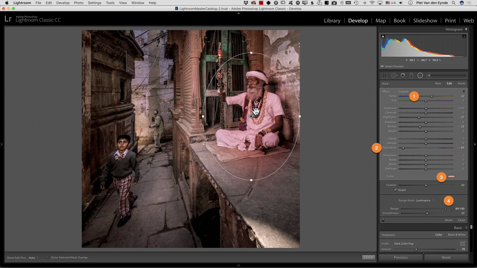
With the color of the towel blending in more into the environment, a new problem surfaced: the sadhu's clothing looks a bit too neutrally white in comparison to the rest of the scene. I solved this problem in a way that was comparable to the previous step but I used a Radial Filter instead. I drew one over the sadhu and adjusted the color with a combination of the Temperature (1), Saturation (2) and a custom color (3). In this case, I did not choose the Color Range Mask but the Luminance Range Mask to further narrow down the selection. By setting the slider to only affect tones in the 89 to 100 values, I could direct the color change only to the sadhu's white clothes. So, a combination of a Radial Filter and a Range Mask once again let me perform a difficult task with relative ease. For me personally, these new range masks alone are worth the price of the monthly Lightroom subscription. Definitely something to consider if you're still using Lightroom 6.
Step 9: Adding Radial Filters to the three People in the Image
Because I was after a dark, moody image, I wanted to darken the area around our three subjects a bit more. I could obviously do that with the Adjustment Brush, but that involves painting and I try to avoid that. So I used a little roundabout technique: I added three Radial Filters, each brightening one of the subjects (you can see all three of them together in this screenshot - normally you can only see one at a time). So they were now brighter than their surroundings and in fact a bit too bright. Then I turned to the Basic Panel and lowered the overall Exposure. The net result was that the people kept more or less their original brightness value and the background got darkened. Sometimes, the fastest way to do something in Lightroom is to take a detour!
Step 10: Burning with the Adjustment Brush
It's a more or less a constant technique in my postprocessing that I will achieve the general look and feel of an image through one click on a preset or a profile. The time I save in doing so, I will reinvest in local adjustments that can really take the image to the next level. In this case, I used the Adjustment Brush to further burn (darken) the area around the sadhu.
Step 11: More Graduated Filters
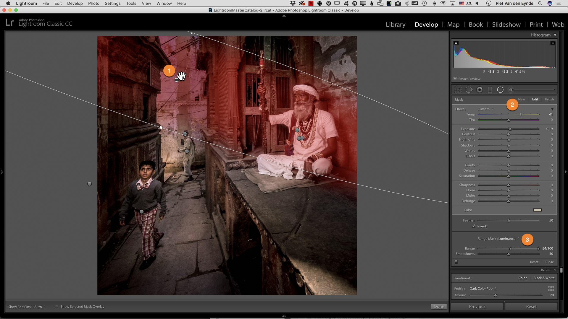
Ok, we're definitely in the area of diminishing returns here, but in order to guide the eye of the viewer even more through the image, I added two more Graduated Filters (shown together here). These darken the edges of the image so your eye is drawn more tho the center. A little like a vignette would do, but only to the left and right, as I wanted to keep the alleyway as it was. As you can see in the Graduated Filter to the right, I used another Luminance Range Mask to protect my subject from being darkened as well.
Step 12: Radial Filter to simulate the Sun
Another technique for which I like to use the Radial Filter, is to simulate the effect of sun rays. The back of this picture is lit by sunlight and I wanted to slighly warm up the neutral (and by comparison cold) flash light we used on the sadhu. So I added a Radial Filter (1) with an increased Temperature (2). Another Range Mask allowed me to focus mainly on the brightest parts of the image.
Step 13: Adding a Split Tone and Grain
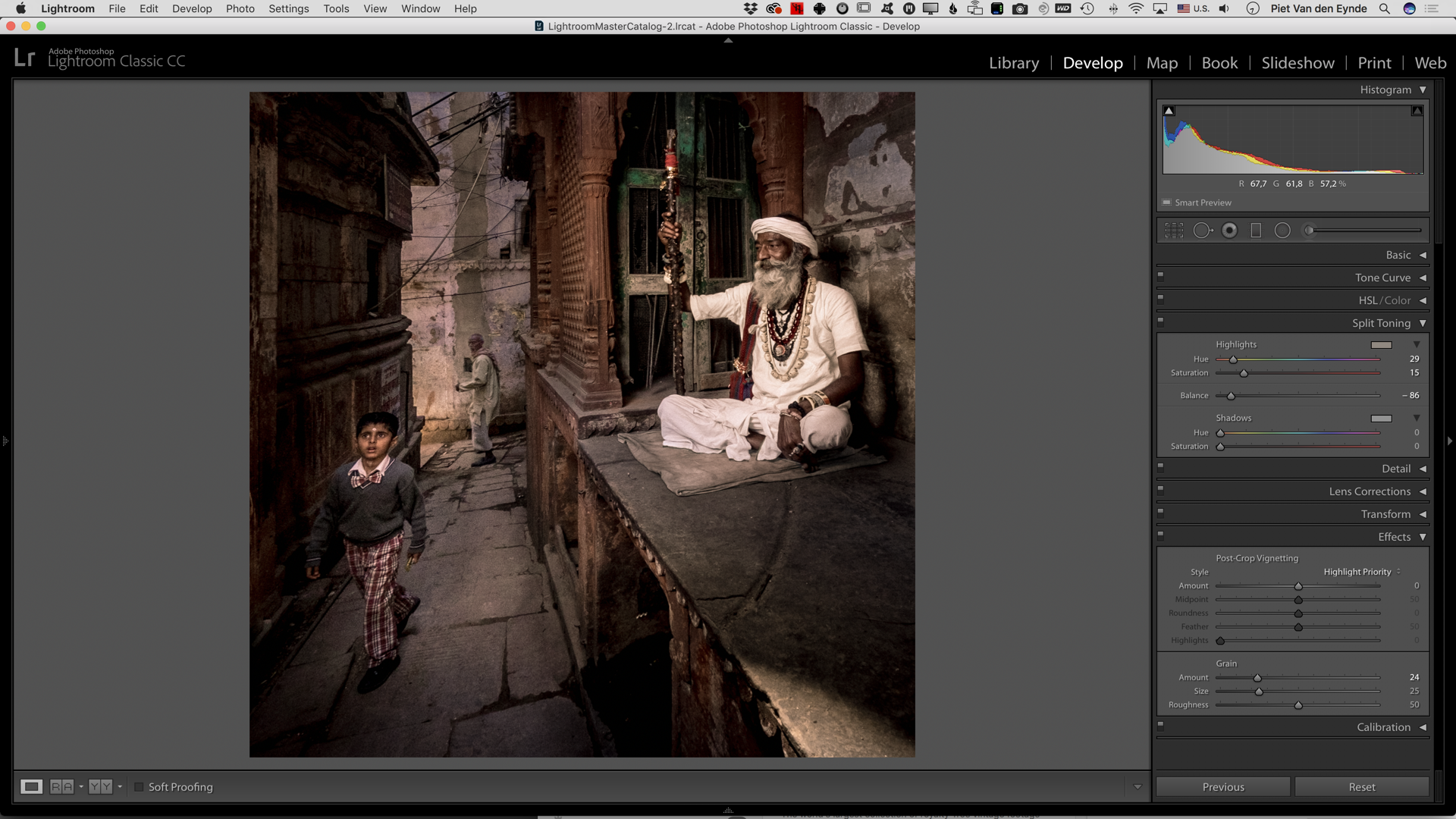
Brightening the left side caused some noise to appear in that part of the image. By itself, that doesn't bother me, on the contrary: some noise can add to a photo's atmosphere but... as the right part of the image was correctly exposed by flash, there was no noise over there. And that difference in noise level is a telltale sign that the photo has been worked on. So, in order to cover my tracks, I added some global Grain via the Effects Panel. Finally, I turned the Highlights in the image a little more yellow by adding a Split Tone. By dragging the Balance slider to the left, I told Lightroom to only tone the brightest highlights, like the ones in the sadhu's clothes.
Step 14: Burning the Lower Right Corner with the Adjustment Brush
As a finishing touch, I also darkened the lower right corner a little more, using an Adjustment Brush.
Finally...
In this Before-And-After tutorial, I wanted to introduce you to a number of techniques that I often use to improve my images. This was a rather extreme example, and I am already bracing myself for comments that will tell me that 'this is no longer photography' and that I 'should get it right in camera'. Believe me or not, but occasionally I do get it right (or at least better) in camera, but there wouldn't be a lot to teach with those images! But most of all, I wanted to show you that sometimes, there's more in an image than you might think at first sight and that it can be worthwhile to invest some time into improving a seemingly hopeless image. Then, you can learn from your mistakes and next time, hopefully, you will get it right in camera!
Wanna join us in Varanasi?
Maybe, after reading this blog post, you're thinking that it might be cool to visit Varanasi, too. It's a fantastic place to hone your portrait skills and there is no better way to do it than through a photo workshop where you'll get all the logistical help you need to create great images yourself. That's why Matt Brandon and yours truly are nose-deep in our agendas trying to set up a new edition of our popular seven day Varanasi Location Portraiture and Lighting Masterclass. If you want to be amongst the first to know about dates and pricing, fill out this form. Below you can see some more images that were made during previous editions of this workshop and some of those came straight out of camera looking pretty close to their final version :-)
How to scale back the effect of a Lightroom preset with the new OPAL plug-in
If you like to work with Lightroom presets, then the just-released OPAL plug-in is a must-have: this plug-in allows you to fade the effect of a Lightroom preset. Without this-plug-in, you'd have to find out what sliders a preset changes and then dial them back individually. This plug-in does it all for you, with one handy master opacity slider.
The video below shows you the plug-in in action. It's available here for $15 (+ VAT in Europe), but code MTW20 will save you a nice 20% ($3) - until further notice. For that price, this is a must-have plug-in for any serious Lightroom user!
Last minute update: the Arrow-Up shortcut only works on Macs. Not sure if this feature will come to Windows computers. For now, Windows users can invoke the plug-in like any other plug-in via File > Plug-in Extras > Opal.
The End of an Era: Lightroom 6.14 is the last update for Lightroom 6
Adobe has just released Lightroom 6.14, the last update for Lightroom 6 users. Therefore, this blogpost is only relevant for those of you who are still on Lightroom 6. If you've already moved to Lightroom Classic CC (the subscription version of Lightroom, this message does not apply to you).
What's new in Lightroom 6.14
Lightroom 6.14 doesn't bring any new features. Only a couple of bug fixes and some new camera and lens support. Among the new cameras, the Sony Alpha 7RIII and the iPhone X are probably the most noteworthy.
What should I do when I buy a new camera in 2018?
Well, you have three options, basically. If you stick with Lightroom 6, you can use the free Adobe DNG converter, which will be able to convert your new camera's files to DNG files which you will subsequently be able to import into Lightroom 6.
The second option is to upgrade to Lightroom Classic CC, the subscription version of Lightroom. Not only will you have continuous camera support, but you'll also gain access to all the new features you have been missing out on for the last 2 years, since Lightroom 6 was introduced. You can find a comprehensive video review of all the features in these blog posts (English, Dutch).
Finally, your last option would be to leave the Lightroom ecosystem altogether and switch to one of the many competing applications, such as Capture One, On1 Photo Raw, Luminar and the like. Personally, I won't be making that switch any time soon, as the only true Lightroom alternative is Capture One in my opinion (because it has database functionality in addition to being a raw developer), and this application doesn't support the Fujifilm GFX. Maybe Capture One think it's too much of a threat for their Phase One Medium Format systems, which are three times as expensive. I personally don't.
How can I upgrade to Lightroom 6.14?
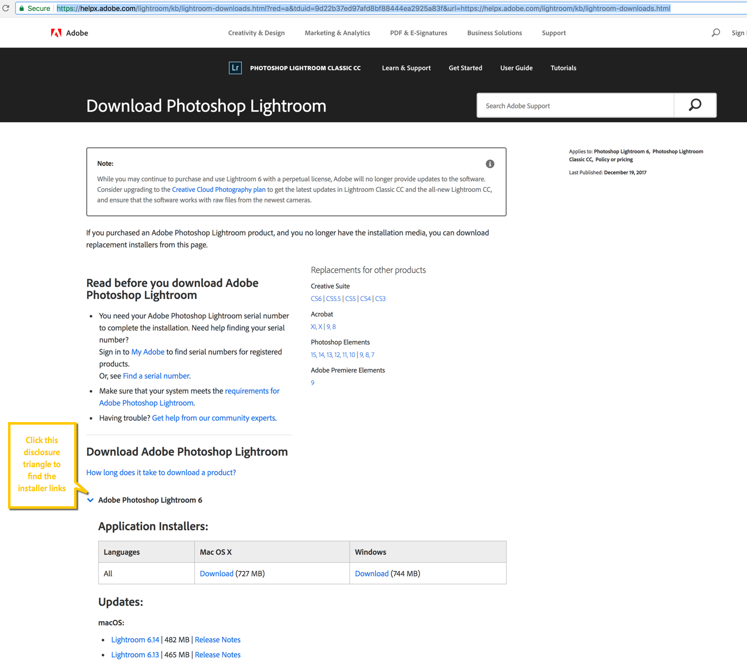
The best way to upgrade is to not use the Adobe Application Manager but to use the direct installer links you find here. This way, you won't accidentally install Lightroom Classic CC instead of the 6.14 update.
December Lightroom Update
A New (and much better) Auto Tone algorithm
Good news for those of you who use Lightroom through Adobe's subscription model (either the full Creative Cloud suite or the Photography plan, including Photoshop). Adobe has just released Lightroom Classic CC 7.1. There are a number of bug fixes in this release, including a fix for the bug where Loupedeck users could not use their Loupedeck in specific languages. There's also support for a couple of new cameras, including the Sony Alpha 7 RIII. But, perhaps most importantly, there is an interesting improved feature: the Auto option in the Tone section of the Basic panel has been completely reworked. Contrary to the old version, the tool can now also change Vibrance and Saturation and it is less prone to produce overexposed results. It uses machine-learning technology and a database of thousands of photographs (and their edits) to come up with a better automatic correction of your images. I was never a fan of the old Auto, because it seemed to be very hit or miss to me... The new Auto however is, although not perfect, quite an improvement. It's definitely worth trying out.
In the above example, Lightroom's Auto did a remarkable job of correcting this severely underexposed image.
A slightly less extreme example, where Lightroom's new Auto helped to reveal sky detail.
Delete Color Mask Sample Points
Another small new feature is that you can now Alt/Option click on an individual color sample in the new color range mask tool, to remove existing sample points. If you're unfamiliar with the range mask tool, this blog post tells you all about it and the other new features. It's one of my favourite features of the October Lightroom Classic CC update.
Lightroom D850 users will be happy to hear that there is now tethering support for their camera.
New features in Lightroom CC
The improved Auto technology is also in the new cloud-centric Lightroom CC App (and in Lightroom for iOS and Android, for that matter). Lightroom CC also received some other new features, such as:
- Tone Curve
- Split Toning
- The ability to edit the Capture Time
- A Full Screen mode (Shortcut: F)
What about Lightroom 6?
If you're a Lightroom 6 user, this update isn't for you. Adobe have announced there will be one more update 'towards the end of the year'. There probably won't be any new features in this update, but there might be support for some extra cameras. If you buy a new camera next year, you'll have to convert its raw files to DNG using the Adobe DNG Converter, if you still want to process the files in Lightroom 6.
What's new in Lightroom Classic CC?
Today, October 18th, Adobe has announced the long-awaited update to Lightroom 6 and Lightroom CC2015, which were released two years ago. The most visible new feature is actually... the name: Lightroom 6 and Lightroom CC2015 are now called Lightroom Classic CC. This probably brings up two questions in your head right away, so let's address the elephant in the room before we talk about the new features. The text below is just a quick summary of my 30 minute video tutorial, so make sure to watch that if you want to get the full lowdown of the name change, its implications and the new features.
1) If Lightroom CC is now called Lightroom Classic CC, what happened to Lightroom CC itself?
Well, in a marketing move that will probably cause confusion for quite some time for Lightroom users and Lightroom educators alike, Adobe has not only rebranded good old Lightroom 6/CC into Lightroom Classic CC, but has slapped the 'Lightroom CC' name on a completely new application. I explain what Lightroom CC is and how it relates to Lightroom Classic in my video round-up. So, bear that name swap in mind when you go online and look for Lightroom training!
2) What happened to Lightroom 6?
Well, this is the elephant in the room. Lightroom 6 does not get an update. You'll still be able to buy Lightroom 6, and there will still be updates with new raw support and updates that would address compatibility issues with upgrades of your operating system, but... only until the end of 2017. So Lightroom 6 is basically a dead-end street. You will still be able to use it in 2018, but if a new version of your operating system comes out that does not play nicely with it, you'll be out of luck. Your options are - to use a term that was popular in personnel management in the big accounting firms in the eighties - 'Up or Out': you can either upgrade to Lightroom Classic CC or basically you'll have to find a new home for your images. Personally, although I fully understand the reasons why people might object to the subscription model, I think the price for the Lightroom Classic CC + Photoshop CC subscription is very fair. In a sort of roundabout way, if you decide to upgrade from 6 to Classic CC, you get a great deal because not only do you get the new features of Lightroom Classic CC, but also you can finally play catch-up with the new features that were introduced in during the Lightroom CC2015 lifecycle as well. I'll do a separate blog post on that later.
3) What are the new features?
Well, the first isn't really a new feature as such, but the engineers main priority was speed. And it must be said that Lightroom Classic CC is faster on a number of levels: switching between Library and Develop, switching between images in Develop and other things have become a somewhat to a lot faster. A lot obviously also depends on your configuration.
4) Aside from speed, are there any REAL new features?
Yes, there are two really nice ones in my opinion, and I explain them in detail in the video, so i'll just sum them up briefly here: the first is a feature that high volume photographers will love. In fact, to me it would be worth upgrading from 6 to Classic CC only for this feature: you can now use the embedded JPG in a RAW file to zoom into your image to determine sharpness instead of having to wait up until ten seconds for Lightroom to build its own 1:1 preview. Really folks, this is huge!
The second new feature are two new Range Masks found in the local adjustment tools: you can now refine a mask that you made with the Radial or Graduated Filter or the Adjustment Brush using a luminosity range slider or a color picker. I have a couple of examples in the video and I really love this new feature.
Other than that, there are a couple of minor improvements but those two features and the speed improvements are the real stars of this update. And, although they might not look as impressive as the CC2015 headliners (HDR, Pano and People View), they're features that really help to speed up your everyday workflow.
So, what do you think about the name change and its implications and... about the new features? If you're on Lightroom 6, will you upgrade to the subscription or will you turn to one of the competing raw converters? I would love to hear your thoughts in the comments.
Review: Western Digital My Passport Ultra 3TB
As a photographer, you can never have enough storage space. Especially if you’re of the traveling kind and your laptop’s internal hard drive is limited.
I already reported about one of my favorite external drives for traveling, the WD My Passport Pro (review here).
Now a while back, WD introduced a new portable drive, the My Passport Ultra. There is also a Mac version of this drive, the My Passport for Mac. Except for the name, both are identical, it’s just that one is pre-formatted for Windows and the other is pre-formatted for Mac. The review copy WD sent me was an Ultra. As I use a Mac, I changed the formatting to HFS+. Easy enough.
75000 raw files on a pack of cigarettes
Compared to the My Passport Pro with its built in dual drives and raid system, the My Passport Ultra technically is a lot simpler: inside is a typical 2.5 inch laptop drive (you have a choice between 0.5, 1, 2 and 3 TB). At 5400 rpm, the drive itself is no faster or slower than the majority of other small external drives. The interface is USB 3 (backwards compatible with USB 2). What really sets this drive apart is its size and weight, or rather lack thereof: the 3TB version I tested weighs less than 250 grams (0.5 pounds) and at 21 x 81 x 110 mm (0.83 x 3.21 x 4.33 inches) it is not much bigger than a pack of cigarettes. At an average of 40 Mb per raw file, this means it can contain 75000 raw photos. Seventy Five Thousand! On a drive that fits in a shirt pocket! There won't be any more room for those cigarettes then, but they're bad for your health anyway. The beauty is that it’s USB powered, so no need to lug around a power supply that sometimes weighs more than the actual drive.
Possible uses
As you know from this post, I use a separate SSD drive to store my Lightroom catalog on. But SSD memory is far too expensive and limited to store your actual images on. And that's where this My Passport Ultra comes in. There are a couple of ways to include the Ultra in a portable Lightroom workflow:
- If you are a high volume shooter, you can use it exclusively for image storage. As I mentioned, if you calculate at an average of 40 MB for a raw file, the drive will contain up to 75.000 of them. If you shoot JPEG only, you can easily multiply that by 5. Just make sure you make regular backups to another drive. You don't want to lose 75.000 images in one go! You could get another My Passport Ultra, obviously, but you could also opt for a cheaper, bigger external hard drive with a separate power supply which would cost about half. You would then leave the bulky backup drive at home (or in your hotel room) and take the My Passport Ultra with you when you go out the door. Never leave your backup drive and the drive with your originals together in your hotel room!
- If you normally store your images on your internal harddrive, you could use the Ultra as a small and lightweight backup-only drive, although in that case, you probably don't need the 3 TB model!
- Personally, I make a hybrid use of the drive: as I'm really paranoid about losing my images, especially while traveling, I import them to my My Passport Pro, which is set up in Raid 1. That means if one of both drives in the My Passport Pro fails, I still have my pictures. However, Raid 1 does not protect me from theft or fire or other damage, and that's where the My Passport Ultra comes in: I've split it into two partitions. One, 1 TB in size acts as a Time Machine backup for my MacBook Pro's internal 1 TB drive. The other, 2 TB in size acts as a backup for the My Passport Pro. I've attached some velcro to the back of the My Passport Ultra (and to the back of my laptop case) so I can easily attach the drive to my laptop when I'm working.
The above use cases are just examples. I'm sure you can come up with your own ideas on how to use 3 TB of storage!
Price
This drive exists in a 0.5, 1, 2 and 3 TB version. Personally, I don't know who would buy the 0.5 TB version unless you're a photographer with lots of self-restraint. The 3 TB version costs around € 200 / $ 200. You do pay a premium for the small form factor, but I find the price to be very reasonable, especially given its extreme portability.
My Passport Pro or My Passport Ultra?
The Pro and the Ultra are different drives for different needs. For me, the main advantage of the My Passport Pro lies in the fact that it saves to two drives automatically, offering an initial and automated backup. However, having said that, you still need a secondary backup of the data that's on a My Passport Pro. After all, the drive can get lost or stolen, too.
If you don't mind making your own backups (on my Macs, I use Shirtpocket's SuperDuper), for the price of one My Passport Pro 2+2 TB, you can buy two My Passport Ultra 3 TB drives, giving you more flexibility and more storage.
Conclusion
I like the My Passport Ultra a lot. It's so small and lightweight that you can bring it with you wherever you go. The only disadvantage I could come up with is that the drive's housing isn't shock-resistant or weather-sealed, which would undoubtedly have added to the weight, size and... price! Other than that, if you’re looking for a lot of storage in a light small, convenient package, then look no further. Especially for laptop users this USB-powered drive combines convenience with ample storage without adding much bulk. Just as always, make sure to back up your data. No drive, regardless of the manufacturer, is failsafe.
Fading Lightroom presets with The Fader
If you love Lightroom presets as much as I do, you may already have experienced situations where a preset is just a tad too strong, or - the less likely scenario - not strong enough for your taste. Instead of trying to manually tweak all the preset's settings, there's a cool little plug-in that does the work for you.
It's called The Fader and it's available here. Best of all, until the end of this month (October), it's half price, only $5. The video below shows you how to install and use it.
An advanced Smart Filter workflow with Alien Skin Exposure and Nik Software Viveza
If you follow this blog or if you've read some of my eBooks, you know I love working with plug-ins. For example, for film simulation I really like Alien Skin's Exposure. For local edits like dodging and burning, I like the Control Point technology found in Viveza by Nik Software. In this video, I'll show you a way to combine the best of both worlds, all while keeping your effects completely re-editable.
Now that is one cool workflow, isn't it? I actually forgot to mention yet another advantage of the Smart Filter workflow in the video: if you double-click on the icon in yellow (see screenshot below), you enter the Smart Filter's Blending Options. In that dialog box, you can not only change the Blending Mode for extra effect, but you can also reduce the Opacity to globally scale back the effect of the plug-in without having to dial back all of the individual sliders!
I hope you learned something from this 12 minute video. If you did, imagine what you could take away from 70+ hours of video tutorials (and over 10 eBooks, and hundreds of Lightroom presets): for only a couple of more days, you can take advantage of the 5 Day Deal, a unique bundle of photography training resources (including some 5 hours of video training by yours truly) that normally retails for over $3.300, but that can now be purchased for only $127! With 39 top-notch instructors like Zack Arias, David duChemin, Lindsay Adler and Joel Grimes and one über-geeky Belgian-with-a-strange-accent (that would be me) you're bound to learn a ton!
You can grab that bundle here and you're not only doing yourself and your photography a favour: 10 percent goes to charity. Last year's 5 Day Deal raised over $200.000 this way!
If you still need some convincing, check out yesterday's announcement post!
Using the Angelbird 512 GB SSD2go pocket as a Catalog Drive with Lightroom
The Angelbird 512 GB SSD2go Pocket
During a recent tradeshow, I came across the people of Angelbird Technologies. Angelbird is an SSD storage developer and manufacturer.
So amongst other SSD solutions, they develop and manufacture external external Solid State Drives (SSDs).
I was immediately struck by the simple and elegant design of their SSD2go pocket. When I suggested the drive might be an interesting option for photographers to store their Lightroom catalog on, I was offered to try one out. This drive is about as small as it gets for an external drive: it measures a mere 89.0 x 69.9 x 10.4 mm (3.5 x 2. 75 x 0.41 inch) and weighs only 90 grams without the cable. Speaking of which, I was happy to see that Angelbird uses a different kind of USB3 cable: one that looks like the old, standard USB2 cables. The main advantage is that this type of cable fits much tighter in the drive's and your computer's USB port. As I use this drive a lot plugged into my laptop when I'm running Lightroom, this diminishes the risk of me accidentally pulling out the drive's cable. Especially with the intended use of the drive as a Lightroom catalog drive, this is a big one, as (accidentally) disconnecting a catalog drive when Lightroom is still running can wreck all kinds of havoc, including catalog corruption! Not with this drive: I can actually have the drive dangle from my laptop and it still won't disconnect!
I won't bore you with the technical details (you can find those on the Angelbird website), but suffice to say that the drive is really fast: how does a Sustained Read Speed of up to 450 MB/s and a Sustained Write Speed of up to 390 MB/s sound? The Angelbird people seem to put a lot of attention to details: there's a five year warranty (still, don't forget to back up as no company will give you your data back), the unit comes with two cables and you can choose two lines of custom engraving to appear on the back of the drive. This is more than a gimmick: I put my website and telephone number on there, in case I ever lose the drive (with that minute size, something to consider!). For the fashion-conscious: you can choose between 4 colours. Again, this can be handy to easily tell drives apart.
So, where does this drive fit in in a Lightroom workflow?
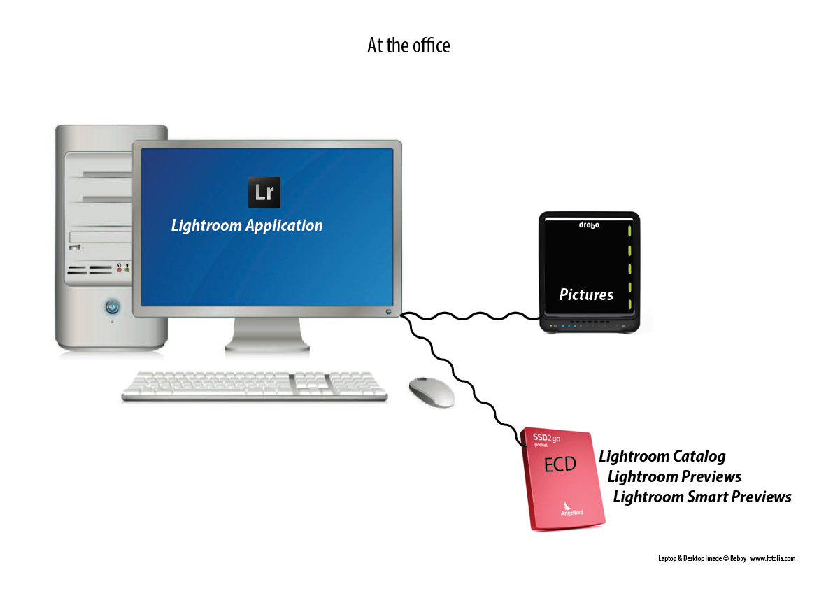
Working with two computers and an ECD (External Catalog Drive)
Quite a number of photographers have two computers: a laptop and a desktop. As you might know, you can’t put your Lightroom Catalog on a network drive. Prior to Lightroom 5, if you kept your catalog on the internal drive of your desktop and you wanted to edit (part of ) your images on the laptop, you had to export those images as a catalog to an external drive, attach that drive to your laptop, open the exported catalog on your laptop, edit the images, and then reimport that changed catalog back into your main catalog on your desktop via File > Import from Another Catalog. If this sounds convoluted, well, it’s because it is; it’s definitely something for more advanced users and not something that you would want to do a couple times a day.
The alternative used to be that you could put your catalog and also your images on one or more external drives and then attach those to the computer you wanted to work with. But large external drives aren’t easily transportable, nor are they meant to be! And they tend to be slower, too.
Smart Previews to the rescue!
Smart Previews, introduced in Lightroom 5, offer a solution: the workflow consists of putting your catalog (and therefore the regular Previews and the Smart Previews) on a fast external drive (I call this the ECD for ‘External Catalog Drive) such as the Angelbird SSD2go pocket. The images themselves can then reside on the internal drive of your desktop computer, or on yet another external drive normally connected to that desktop computer.
You then simply connect the ECD to the computer you want to work on at that moment. On your desktop computer, you will be working on the originals; on your laptop you will be working on the Smart Previews.
POWER TIP: If you also put the Mac and Windows trial versions of Lightroom 5 (which you can download from the Adobe website) in a folder on your ECD, then you can literally open your catalog anywhere in the world, even if you don’t have your own computer on hand; just install the trial version on any (compatible) computer and you can get started!
Adding a 'Work in Progress' folder to the mix
Technically, my Lightroom Catalog and previews could fit on a 256 GB model, yet, I opted for the larger size for two reasons: it gives me some extra headroom for when my catalog grows (each extra file I import means I need to put about a 5 MB 1:1 preview and a 1.5 MB Smart Preview on the ECD) but it also allows me to put a 'Work in Progress' folder on the ECD: this is especially useful if you want to be able to edit files not only in Lightroom but also in Photoshop. Smart Previews can only be edited in Lightroom. So, I make it a habit to import recent files to a 'Work in Progress' folder on the Angelbird SSD2go pocket. This allows me to edit them in Photoshop or plug-ins, even when I'm on my laptop!
Catalog Backups
One thing to watch out for is your catalog backup: make sure that you’re even more rigorous than otherwise when it comes to making backups because external drives of course run a higher risk of getting lost or stolen, or—in the case of the classical, rotating drives—to fail. So, save your catalog backups on the internal drive of the desktop or laptop (or alternating between both) and verify in the back-up dialog window whether Lightroom is indeed backing up to the correct drive. Now that Lightroom 6 compresses your catalog backups, this extra security costs you even less in terms of storage space.
Isn't Dropbox an alternative?
An alternative to using an ECD would be to store your catalog (and the Previews and Smart Previews) on Dropbox. However, that not only requires a paid subscription (the free accounts are too small to store anything but a minute catalog) and moreover, it requires rigourous attention to waiting for your catalog to sync across your systems before opening it up on the other machine. Otherwise, you risk opening an outdated catalog and the longer it takes to realize that, the bigger mess you're in. Also, synching larger catalogs and previews can take quite a while. Therefore, the Dropbox route is one I don't personally use nor particularly recommend.
A little bit of Velcro goes a long way
Even though, as mentioned before, the Angelbird's USB cables fit firmly in the USB port, I still want to avoid unnecessary mishandling of that port. That's why I've added some velcro on the Angelbird's back as well as on my laptop's protective cover. They loose some of their design cool, but it's just easier to transport both through the house as I go from one room to another.
Conclusion
For anyone looking for a fast and hassle-free external drive to put their Lightroom catalog on so they can use it in a multi-computer setup, the Angelbird SSD2go pocket is a great choice. It exists in 3 sizes up to 512 GB. Because you only store the catalog itself, the previews and the smart previews, those capacities will get you a long way. Even if you don't need the full 512 GB right now, having some extra room could be handy because you can use it to store your 'Work in Progress' as well. Add to that the light weight, small size, lightning fast transfer speeds and great looks and it's easy to see why the Angelbird is now my favourite external catalog drive for Lightroom.
Angelbird's SSD2go pocket is available from the Angelbird website as well as a list of international retailers (the bespoke engraving is only available through their website). Prices start as low as 169 € for the 128 GB model.
This is an adapted excerpt from my Lightroom 5 Up to Speed + Lightroom 6 Unmasked eBook bundle. Between them, these two eBooks offer over 400 pages of solid Lightroom advice, tips and tricks and case studies. The bundle is available for a mere CAD $20 through www.craftandvision.com. (Scroll down from the product page to add the bundle to your cart instead of the individual eBooks).
Wirelessly tethering your camera into Lightroom with an Eyefi MobiPro SD Card
In a previous blog post, I did a review about the new Eyefi MobiPro SD Card. You might want to read that blog post first before watching this video. One of the conclusions was that for real-life tethered shooting (e.g. in a studio), wirelessly sending over raw files is just too slow (unless you're paid by the hour). So, in this follow-up article, I want to investigate an alternative workflow, which is a lot more efficient. Basically, I use this technique to wirelessly tether my 3 year old Fujifilm X-Pro 1 into Lightroom and it works like a charm! You can pretty much use this technique with most cameras that use SD cards.
The main workflow is as follows:
- Set your camera up to shoot raw + JPG
- Only transfer the JPG files wirelessly from the Eyefi card to your computer (that's the default Eyefi setup anyway)
- Use Lightroom's Auto-Import feature to import the wirelessly transferred JPG files into Lightroom
- Make any edits, add star ratings, keywords and pick or reject flags to the JPG files during your tethered shoot
- At the end of the shoot, copy the raw files over from the SD card to the same Lightroom folder the jpg files are in, 'the old fashioned way', i.e. manually using Lightroom's regular Import dialog
- (And this is the magical part) Have Lightroom automatically synchronise any edits (except for cropping) and metadata from the jpg files to the corresponding raw files, using John Beardsworth's Syncomatic plugin.
That's the short and sweet version. You can get the full lowdown in this video.
An audio interview with me on Faded & Blurred
I am very honoured to have been interviewed by Jeffery Saddoris from the well-known Faded and Blurred blog. I just love that url, by the way: Faded and Blurred. It makes me think of a Lightroom preset, but I digress!
Jeffery is a great interviewer: an hour passed by and I hadn't even noticed. Anyways, if you have an hour to kill between charging your camera batteries and you want to hear me ramble about how I think of Lightroom graduated filters while I am driving in my car and other stuff, the interview is here.
From that page, you can also subscribe to the podcast. There's some excellent interviews in there!
Creating the 'Grungy Retro' style in Lightroom
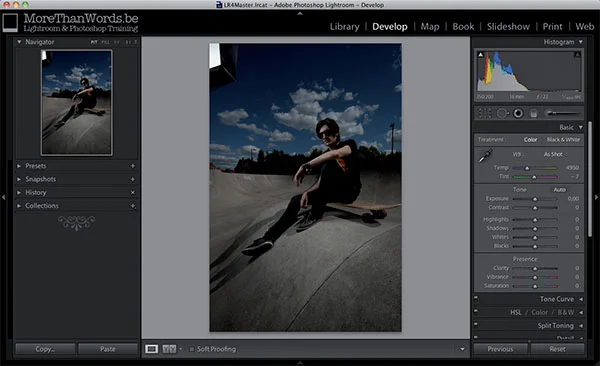
As with everything else, photographic postprocessing is subject to trends. One specific trend, which was kick-started by smart phone apps such as Hipstamatic and Instagram, is what I would call “retro-grunge”: a warm retro colour palette, slightly desaturated and mixed with grungy, worn-out finishing with lots of local contrast that really let structures and textures shine through. In the following tutorial, I'll show you how to recreate this effect using Lightroom.
1. The preparation.
You should always photograph with your post-processing in mind. In this case, I combined sunlight and flashlight in a cross lighting setup in order to render my subject in a three-dimensional way. The image is underexposed but that doesn’t matter that much as long as the mix between ambient and flashlight is OK. And anyway, my flashes just couldn’t go any stronger.
2 Basic corrections.
I selected the Auto Lens Corrections checkbox and increased the Exposure in the Basic panel to +1.15, simply because the image was underexposed. So, this specific correction is not part of the look we want to achieve. The following PV2012 settings are typical for the “grungy” look we’re after: negative values for Blacks and high positive
values for Shadows, in this case -20 and +100 respectively. I also bumped the Clarity slider up (+50) as it accentuates textures and structures. To create the worn out look, I lowered Saturation to -55 and increased Vibrance to +15. I reduced Contrastbecause the other edits had already increased it more than enough.
3 Editing colours in the HSL panel.
Of all Lightroom panels, the HSL / Color / B & W panel is undeniably my favourite (apart from the Basic panel of course). You can use it to tweak colours without having to resort to the Adjustment Brush. In this image, I increased the Saturation of Green(+45) and Blue (+40) because the global desaturation in the Basic panel had made these colours too pale. I also dragged the blue channel’s Hue 25 units to the left making it more like a bluish green. Finally, I increased the Luminance of blue to +20.
4 More colour tweaking in the Split Toning panel.
You can adjust colours not only in the HSL panel, but also in the Split Toning panel.
I chose a warm Hue (55) for the highlights and a cool one (230) for the Shadows. Both Saturation sliders allow you to dial in the strength of the effect: I chose 33 and 10
respectively.
5 The Effects panel: vignetting and grain, your digital thickener!
It’s common to finish images like this off with a vignette. I also added some grain. Not only does this look nicely retro, it also is done for a practical reason: if you post-process images really hard, you might degrade image quality, causing certain parts to disintegrate more than others. In order to restore some uniformity into the way your pixels look, you can use grain as 'digital thickener'.
6 Finishing off with local adjustments.
This image was finished with three local adjustments: a graduated filter starting from the bottom right corner set to positive Clarity and negative Highlights to accentuate the concrete even more, a brush with negative Exposure and negative Highlights to tone down the disturbingly bright triangle under the skate and finally a brush with positive Shadows and positive Exposure to further lighten up the skater somewhat.
7 Saving your work as a develop preset.
Of course, you can save this look as a preset so you can apply it to other comparable images. It’s important to only select the effects that are indispensable for the look you are after, not the adjustments that were unique to this image (such as the exposure increase in step 2).
8 Applying to other images.
The nice thing about presets is that you can quickly apply them to other images. The Navigator window at the top of the Develop module’s left panel already gives you a clue as to how the image would look with that effect applied to it. Of course, the more the image resembles the original image in terms of tonality and atmosphere, the better the effect will be.
Sometimes, you have to tweak the result slightly, but still, presets can not only save you lots of time, they can also make images that were shot at entirely different moments in entirely different locations visually match, which can be a good thing if you want to use these images together in a photo album or an exhibition.
This is only one way to create such a vintage effect. By experimenting or Googling 'Lightroom vintage preset' you can find lots more. I quite like Kevin Kubota’s Vintage Delish set of Lightroom presets and if you're more into the faded vintage look, then I absolutely recommend Stu Maschwitz' Prolost Bespoke Vintage presets. If you're into black and white images, check out my Lightroom Black & White preset package.
9 Alternatives.
If you don’t have the patience for this technique, or if all you want is ready-to-go solutions to achieve these kinds of effects, there is a slew of plug-ins that can help you.
- Alien Skin Exposure and DxO FilmPack are specifically aimed at simulating old analog films.
- Color Efex Pro 4 by Nik Software and Perfect Effects by onOne Software offer these kinds of looks as a subset of a larger array of filters and effects.
This blogpost is an adapted excerpt from my Lightroom 5 Up to Speed eBook, which offers over 300 pages of Lightroom training content. For a limited time, you can get Lightroom 5 Unmasked and my latest eBook, Lightroom 6 Up to Speed at a 25 percent discount. Get the bundle from the product page.
Content Aware Fill, the Lightroom way
The following short video tutorial shows you how to make finishing touches combining one big brush with smaller, overlapping ones to hide the seams.
Read MoreNew in Lightroom CC/6: duplicating and moving adjustment brush masks
This is one of the smaller features in Lightroom CC/6 that will probably be overlooked in many reviews but it's one of my personal favorites: as of now, you cannot only duplicate the mask of an Adjustment Brush, but you can also move it. You do so by selecting the little pin that represents a mask and then dragging it around.
Read More